
This is a comparison between the products I created for the preliminary task and the final products. As you can see the layout, colour scheme, typography, photography, and overall finish have improved greatly since the beginning of the project. The main cover image is lit much better and it 'interacts' well with the typography. The photograph location is much more suited for the magazine as well. The masthead is more attractive and the cover lines are more experimental and attention grabbing when positioned at an angle with coloured boxes to back them.
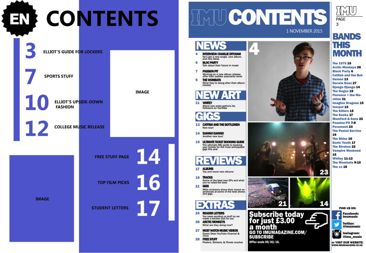
The contents page now has a layout that is more comfortable to read in its specified columns and I've added things like convergence and a band section. I've used more images than planned so that the reader has more to look at and something to refer to when considering the contents of the magazine. The logo is also more prominent, frequent, and simple which improves brand image.
Note: This Evaluation was completed before a few final changes were made to the contents and DPS final products.
Note: This Evaluation was completed before a few final changes were made to the contents and DPS final products.
No comments:
Post a Comment